A Formula for Finding the Right Elementary School


My son is going to start kindergarten next year. That means that my wife and I are presented with an issue that is commonly faced by young families in the city at about this time: should I stay or should I go?

Philadelphia, by and large, does not have great schools. The district‘s overall rating on Great Schools is a three out of ten. There are a few decent elementary schools, but they are all located in very expensive neighborhoods, and some are so crowded that they’ve started having a lottery for kindergarten classes, so there’s no guarantee that your kid will get to go to that school just because you live in its catchment area.

On the other hand, Philadelphia’s suburbs are home to some of the best schools in the country. On Niche’s 2018 Best School Districts in America list, three of the top 25 are in the Philadelphia metropolitan area. Unfortunately, most of these areas lack a lot of the amenities that we’ve become accustomed to in Philadelphia: their walk scores are lower, and the commute times back to Center City would be higher.

So, how do we objectively weigh the desire for great schools with the desire for a walkable environment? With math! All I needed was a formula to determine what areas were worth looking at in greater detail. Through a process of trial and error, and through lots of discussions with my wife, I determined what factors are important to us in a location, and weighted those factors based on which ones mattered most. So here are our variables:

Great Schools Score

Great Schools rates nearly every public and charter school in the country on a ten-point scale. The rating is based primarily on state-level standardized tests, so comparing schools across state lines isn’t exactly apples-to-apples, but the fact that it covers so many schools still makes it one of the best measures for determining school quality. In some areas, student progress and college readiness are also taken into consideration when assigning a school a rating.

Presence of a Playground

As I began looking at schools in my neighborhood, I was surprised to find that most of them don’t have playgrounds. I wonder if this is an aspect of our suburban upbringing, but my wife and I had just assumed that all elementary schools had playgrounds: between the two of us we attended five elementary schools, and each of them had its own playground (several of the ones I attended had one for smaller kids and a second one for bigger kids). In addition, all the schools that I looked at outside of Philadelphia have their own playgrounds. For my wife and I, although we haven’t thought of a lack of a playground as a deal-breaker, we have heavily weighted schools that have a playground over those that don’t.

Walk Score

Walk score is a measure of the walkability of a neighborhood, or how easy it is to get to goods and services on foot, without getting in a car. Areas that have a walk score over 70 are considered “very walkable.” Most neighborhoods in Philadelphia have a walk score over 90, which makes them “walker’s paradises.” Of all the neighborhoods my wife and I have lived in, the one that had the lowest walk score that we considered acceptable was about 80, so I’m cutting off areas with a walk score below 80 from this analysis.

Median Home Value

I gathered the median home value at the census tract level from the 2015 American Community Survey. I’m using this as a measure of affordability, so generally, the lower the median home value, the higher the score. That being said, there are many neighborhoods in Philadelphia where housing prices are extremely low because they are less desirable neighborhoods. Therefore, I cut off the extra points for cheapness at $100,000.

Commute

I work five days a week in Center City Philadelphia. My wife work from home a few days a week, in Center City a few other days, and in Conshohocken one day a week. She also doesn’t drive. So, for us, it is very important to be able to get to Center City via transit, slightly less important to be able to get to Conshohocken via transit, and much less desirable if we have to drive to either of these places. In some cases it would be quicker to drive somewhere rather than take transit (especially to Conshohocken), but unless driving will save us more than a half hour or so, we’re probably going to opt for transit.

Church

My wife and I are Mormon, and Mormons are assigned to a congregation geographically based on their address. We currently are assigned to the South Philadelphia congregation, and we really like it. While we would be alright going to another congregation, if it were between one place outside of the congregation’s boundaries and an equally good place inside of them, we would go with the second.

With these variables in mind, I analyzed 251 addresses and 209 schools in the Philadelphia area, and came up with the following formula:

Score for a given address = (a – 1) + (if (b = “Y”, 1) * 8) + (((c – 80) / 20) * 7) + (if (d > 100,000, ((636,100 – d) / 536,100) * 6, 0)) + (if ((e – 30) > f, ((70 – f) / 65) * 3, ((70 – e) / 64) * 5)) + (if ((g – 30) > h, ((70 – h) / 54) * 2, ((70 – g) / 46) * 4)) + (if (i = “Y”,1))

Variables:

a = Great Schools rating for the school whose catchment area contains the address

b = Whether or not the school has a playground (Y/N)

c = Walk score of the address

d = Median home value for the census tract that contains the address

e = Commute time from the address to Center City office via transit

f = Commute time from the address to Center City office via car

g = Commute time from the address to Conshohocken office via transit

h = Commute time from the address to Conshohocken office via car

i = Whether or not the address is within my church congregation’s boundary

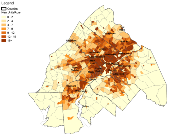
Then, these being schools, I gave them a grade, and I graded on a curve: those addresses whose scores were 90% or more of the highest score got an A, those from 80-89% got a B, etc. Here’s what that looks like on a map:

Only two schools get A’s: the Greenfield School and the McCall School. These two schools cover much of Center City. They have high Great Schools ratings (7/10); both schools have playgrounds; areas in both catchment areas have walk scores as high as 100/100; they’re within walking distance of the Philadelphia offices and have good access to regional rail stations, which means good access to Conshohocken; and parts of their catchment areas are within my church congregation’s boundaries. Really, the only downside to these areas are cost; parts of these school’s catchment areas are some of the most expensive neighborhoods in Philadelphia. For my family, in order to get into a good school in a good neighborhood, we will probably have to live on the cheaper edge of a more expensive neighborhood, and even then, we’re probably going to get less house for our dollar than we’re getting right now.

The B schools are a little different: they include the Independence Charter School in Center City, the Penn Alexander School in West Philly, and the Penn Wynne School in Ardmore. They also have high Great Schools ratings (6, 10 and 10 respectively); all have playgrounds; while lower than the A schools, their catchment areas all include places with walk scores above 90; commutes for Independence and Penn Alexander are somewhat similar to those in Center City, and the part of Penn Wynne’s catchment area in Ardmore has good regional rail access to Center City and is a fairly short drive to Conshohocken; unfortunately, only Independence would be located within my church congregation’s boundaries. Throw in that Penn Alexander has a lottery for its kindergarten class and you can see why these otherwise quality schools aren’t quite as strong of a match for us.

Beyond these schools, the good options for my family dry up pretty quick. Most other schools in the region either have low Great Schools ratings or are too far from town to make commuting the way we want to reasonable.

So, will we stay or will we go? Probably stay. Ardmore is still a possibility, but based on my analysis, a really good school in Philly is a better fit for us than a great school out in the suburbs. Now I just have to figure out how to afford Center City rent.

What does a house look like?


Find a little kid and ask them to draw a house. Go ahead, I’ll wait.

Finished? Alright, chances are, your kid’s drawing looks something like this:

image

Single-family, detached house with a pitched roof and a chimney in the middle of a yard with no neighbors in sight.

This makes sense in a lot of places; for a lot of American kids, that’s probably the only type of house they’ve ever lived in. The funny thing is, I think this image is so archetypal that even kids who live in a city like Philadelphia, where there are almost no houses that look like this, would draw something like this if asked to draw a house. So I wanted to look and see; in America’s biggest cities, what does a standard house look like?

I made a list of America’s 50 largest cities, and looked up information on housing units from the American Community Survey (ACS) conducted by the US Census Bureau. The ACS classifies housing types into ten groups, based on the number of housing units in the building: 1, detached (single-family detached homes); 1, attached (rowhouses, townhouses, and twins); 2 (duplexes); 3 to 4, 5 to 9, 10 to 19 (small apartment or condo buildings); 20 to 49, 50 or more (large apartment or condo buildings); mobile homes; and other (boat, RV, van down by the river, etc.). I included the national numbers for comparison. The results are below, and a spreadsheet with the information can be found here.

House Type Graph

Of the top 50 cities in America, 39 had a lower percentage of single-family detached housing than the nation as a whole; however, detached housing is still the predominant form of housing in all but six of the cities, and made up more than half of all housing units in 27 cities. Of the six cities where detached housing was not the primary form, there were three types.

In New York, Miami, and Washington, DC, the primary housing type is large apartment buildings such as towers. In New York this building type is very dominant, whereas in Miami it is only about 4% higher than detached housing, and in DC it is less than 1% more common than rowhouses.

Philadelphia and Baltimore are the only cities in America where rowhouses are the predominant housing type. In both of these cities, they make up more than 50% of housing units. Philadelphia has the lowest percentage of detached housing on the list, at just over 8%.

And all on its own, Boston’s predominant housing type is 3-4 unit apartment buildings. These come mostly in the form of the New England triple-decker, a three-story apartment building with one unit per floor.

boston_-_buildings_13

The other thing I notice looking at the results is that it shows the lack of small-scale multi-family housing, also known as “missing middle” housing. This housing type is important for providing affordable housing without some of the negative consequences of the highest density forms of housing. They also provide a smoother transition between detached and high-rise forms of development, and allow the density that is necessary for mixed-use development.

So is the first image what a “house” looks like? Well, for a lot of people, yes, but not for everyone. For some people it looks like a rowhouse, or a garden apartment building, or a condo tower. But it’s important for cities to have a better mix of these types, so that there is room for anyone regardless of what sort of house they call home.

The South Philly Studio Project: Neighborhoods – Step 1 (Centers)


I’ve decided to start something of an intellectual exercise. I really loved school, especially my workshop and studio classes where we got to really get into a neighborhood, analyze it, and propose physical improvements for it.

So I’m just going to do that.

I’m going to use Emily Talen’s Urban Design Reclaimed to guide this project, because a) it’s just a good book and b) it breaks the planning and design process down into small, quickly accomplished steps, which I think will improve my posting schedule. Initially, I’m planning on focusing on southwest South Philly, in the area bounded by Broad Street, Passyunk Avenue, and Oregon Avenue.

While this will be something of an academic project and I’m not planning on holding any public meetings or anything, I would welcome collaboration, either in the comments section here or on Twitter, where I’m @davidbmunson and am planning to use the hashtag #SouthPhillyStudio.

I think this could be a lot of fun.

Neighborhoods

The first section of Urban Design Reclaimed addresses “citywide issues requiring a big picture view,” and the first exercise in this section deals with neighborhoods. The purpose of the exercise is to determine a set of neighborhoods, each with a center and a boundary.

Step 1 (Centers)

The first step in the exercise, and the subject of this post, is the identification of potential neighborhood centers. Talen suggests a series of potential neighborhood centers: “street intersections, civic spaces like schools and parks, and commercial areas.” These potential centers can be found on the map below. Since there are no arterial streets cutting through the study area, I mapped the intersections of collector streets within the neighborhood. Parks have their own layer; civic spaces include schools, churches, rec centers, hospitals, police/fire stations, and libraries. I mapped areas of primarily commercial use, as well as corner stores within the neighborhood.

The next step would be to map a quarter mile around each of these potential centers to make sure that the neighborhood has good coverage, but it’s plainly apparent to me that the entire study area would be completely covered. I came up with two alternatives for how to map potential centers: eliminate the corner stores and intersections from the map, as they are the most ubiquitous; or, map corners where at least three of the four corner properties are some sort of potential center, thus creating what I’m modestly calling super centers.

Either alternative completely covers the study area, as shown in the maps below.

The result of the exercise is that there are sufficient potential neighborhood centers throughout the study area that any resident could walk to one in less than five minutes. The next step is to delineate neighborhood boundaries within the study area, which I will do in my next post.

Bicycle and Pedestrian Level of Service


Level of service (LOS) is a term used by transportation engineers to assess the quality of a roadway. It typically measures vehicle speed and the amount of delay at an intersection and assigns letter grades A through F, A being a road where “Traffic flows at or above the posted speed limit and all motorists have complete mobility between lanes,” and F being a road where “Flow is forced; every vehicle moves in lockstep with the vehicle in front of it, with frequent drops in speed to nearly zero mph. A road for which the travel time cannot be predicted.”

What you don’t see here is any accommodation for anything that isn’t a car. In fact, since things like narrower lanes and long pedestrian signal times tend to slow down vehicular traffic, there is often an inverse relationship between pedestrian safety and vehicular level of service.

As such, there have been several proposals for how to measure pedestrian and bicycle level of service. Some of these use measures of delay or the density of users in a given area that are similar to those used to calculate vehicular LOS, while others quantify aspects of intersection design that have a unique impact on bicyclists and pedestrians to come up with a score.

One of these measures that is supported by Smart Growth America is the Charlotte Department of Transportation’s Pedestrian and Bicycle Level of Service methodology. It measures eight intersection features for pedestrian LOS and six features for bicycle LOS. Features include things like crossing distance, signal phasing, corner radius, right turns on red, and crosswalk treatments.

As I was looking at this, I thought, wow, doing this for a whole city would take forever. And while that’s true, doing just one intersection takes less time than it takes to watch an old episode of The Gilmore Girls on Netflix, especially once you’ve set up a template that looks something like this. And once you’ve set up your template, it’s easy to start adding the data to a Google MyMap, like this.


And once you have a map, you realize that this could go a lot quicker if you could try and convince some strangers on the internet to help you do it. So I’m asking anyone who is interested in this sort of thing if they would like to work on a big project with me where we map pedestrian and bicycle LOS all across the country. You don’t have to be from Philadelphia, just work in your hometown or a place you’re familiar with. If you’re interested, message me on Twitter @DavidBMunson and I’ll share the map with you. If we can just get this thing started then we can start creating data about the quality of intersections for pedestrians and cyclists that could potentially help cities fix the problems we find and create a better world for all of us, backed up by data.

Revisiting Superblocks in Barcelona


When I read “Superblocks” in the title of this article from Cities of the Future I thought of this:

900x720_2049_1707

Plan Voisin. From foundationlecorbusier.fr.

This is Le Corbusier’s plan to tear down the left bank of Paris and replace it with highrise towers centered in 1,600 square meter superblocks separated by elevated highways. Although Paris was spared this fate, it was accomplished with varying degrees of delicacy and skill in public housing projects throughout the world and to a lesser degree in cities like Brasilia, Brazil; Milton Keynes, UK; and Irvine, California.

spectrum_office-aerial-oct2012-037

Highways separating superblocks in Irvine, CA. From irvinecompany.com.

Nearly everywhere they have been implemented, superblocks destroy walkability and kill urban streetscapes. And considering that Barcelona is one of the most beautiful cities in the world with the Eixample being one of the best implemented systems of urban design ever crafted, I was really worried that they were making a mistake that I thought we had all learned from nearly fifty years ago.

Turns out they were just using a word that had a lot of baggage for me to describe what is really a pretty good idea.

Barcelona recently started implementing its superilles (the Catalan form of superblocks, which sounds much better) in a few neighborhoods and will eventually expand it all the way throughout the city. The superilles are a group of nine blocks where through traffic would be pressed to the exterior streets, and the interior streets would be open only to local traffic. That local traffic would travel on a system of one-way streets that wouldn’t allow shortcuts through the block. Over time, speed limits would be lowered to 10 km/h (6 mph), and the space that had been devoted to cars would be turned over to the people.

This made me think of two of Christopher Alexander’s patterns, one which the superilles go against and one that it agrees with. The 15th pattern in Alexander’s A Pattern Language is the Neighborhood Boundary, where he says, “Form this boundary by closing down streets and limiting access to the neighborhood – cut the normal number of streets at least in half.” I don’t like this idea; it seems exclusionary, it limits the mobility of alternative forms of transportation, and it makes neighborhoods look more like suburban subdivisions. If the main idea is to make it seem like the space belongs to the residents and to keep people from driving through the middle of the neighborhood, the superilles have accomplished that without resorting to walling off neighborhoods.

And the main way that they accomplish it is by applying another Alexandrine pattern, number 49, Looped Local Roads. “Lay out local roads so that they form loops. A loop is defined as any stretch of road which makes it impossible for cars that don’t have destinations on it to use it as a shortcut.” Of course, when Alexander illustrated what this would look like, he drew this:

apl49diagram

From A Pattern Language.

But he also indicated that you could adapt a street grid to meet the requirements of this pattern:

apl49diagram3

From A Pattern Language.

Which of course bears a striking resemblance to the superilles model shown above.

If there is one thing I don’t agree with, it might be the approach to parking. Based on the current plan, the interior streets of the superilles would be closed down to parking. The cars that used to park on those streets would be relocated to newly built parking garages.

Existing-01

Prop by Barc-01

Now I’m not saying that there isn’t a right way to do a parking garage such that it fits into a neighborhood. What I’m saying is that parking garages are very expensive to build, that they eliminate what might be better used as a shop or residence, and depending on where they’re located (it wasn’t made clear in the article where the garages would be located or how far people would have to walk to get to them), it could be much less convenient for residents.

There are certainly different camps on the idea, but I generally believe that on-street parking is a good thing. It’s convenient, and it protects pedestrians on the sidewalk from moving vehicles, which despite being required to drive at about walking speed would still be present on the interior streets of the superilles. My thought would be to consolidate the on-street parking and use it to create a transition zone between the edge streets and the interiors.

Prop by me-01

This would be cheaper to implement than the garages, would provide an equal number of spots if the parking was marked as back-in perpendicular (back-in is generally safer because when it comes time to pull out of the spot you have a better view of the street, and perpendicular fits more cars in a given space than parallel or angled parking), and would create a transition space between the more car-oriented edges and the people-oriented interiors which would help drivers know that they’ve entered a new sort of place.

Implementation of this plan is beginning right now in just a few neighborhoods, but the plan is to implement it all across Barcelona. Going forward, it will be interesting to see if this will work out as planned. The Le Corbusian superblocks that were built didn’t create the sort of environment their architect expected, and even the Eixample didn’t do everything its designer had hoped. But if this implementation is rolled out slowly but surely and course corrections can be made as they go along, Barcelona’s planners may be on track to create another great people-oriented planning success.

A Gondola System for Johnstown


When it comes to public transit systems, gondolas are sort of like Google Glass: they seem really cool, but no one really knows what to do with them or how to make them work. In the last decade or so they’ve been growing quickly, particularly in South America, and some places in the United States have been considering them as an alternative to more traditional forms of transit. While gondolas have certain advantages, they also come with a number of challenges, making their wider dissemination difficult. But in certain situations, such as those present in the small town of Johnstown, Pennsylvania, their unique advantages can provide better transportation service.

The first predecessor to the public transit gondola was an aerial tram system built in 1644 in Gdansk, Poland, which was used to move soil across a river to build fortifications. Early cable car systems were similarly used in mining operations, and the first people to use them for transport were probably miners. In 1893 the first aerial tram system exclusively for moving people was built in Hong Kong, and was used to transport workers to and from a mine. The first recreational cable car was built in 1907 at Mount Ulia near San Sebastian, Spain. After that development, the system was employed at other peaks throughout the alps, and from there became a mainstay at ski resorts around the world.


One of the earliest systems designed to be used for urban commuters was the Roosevelt Island Tramway, built in New York City in 1976. It was intended as a temporary connection between Roosevelt Island and Manhattan until a subway connection was completed, but due to delays in building the subway, it became a permanent fixture. While the Roosevelt Island Tramway and other aerial tram systems like it have a fairly high capacity and can move fairly quickly, they only have two passenger cabins (leading to less frequent service), their design only allows for two terminals and no intermediate stations, and their lines can’t turn. All of this adds up to their application as a form of urban transit being fairly limited.

new_roosevelt_tram_fr_qbb_jeh

From Jim Henderson via wikipedia.org.


The first true gondola public transit system, and to this day probably the most famous, is the Metrocable of Medellín, Colombia. Since 2004, Medellín has built three gondola lines (with two more in the works) that connect to the Metro system and run up into the barrios on the steep hillsides of the Aburra Valley. These barrios are so steep and so dense that regular buses simply couldn’t reach them, and residents were commuting over two hours by foot each way to work. Gondolas are able to travel over the community, rather than through it like a bus on a road would, so the development pattern below isn’t a problem. Using gondola technology rather than the older aerial trams also allows for intermediate stations and allows the line to turn, giving it much more flexibility both in its geometry and in how it serves the residents. Since it’s implementation, Metrocable has inspired dozens of similar systems in South America, Africa, Asia, and Europe, as documented by the Gondola Project.

6264090855_450b558037_b

From Steven Dale via flickr.com.


Metrocable illustrates two situations where gondola public transit is particularly strong: extreme topography and irregular street networks. Gondolas aren’t for everyone; according to this paper by Baha Alshalalfeh, et al, they cost more to build than a standard bus system and have a much lower capacity than more expensive forms of transit. This is one reason why some large system proposals such as that in relatively flat and gridironed  Austin may not work; for the same cost, you could build a tram system that could move about six times as many people.

Johnstown, in a number of ways, is not Austin. If you’ve heard of Johnstown at all, it’s probably because of the 1889 Johnstown Flood, the greatest single-day loss of civilian life in America before 9/11 and the source of it’s unfortunate moniker “Flood City” (though subsequent devastating floods in 1936 and 1977 didn’t help). Johnstown unfortunately has the perfect topography for severe flooding: steep mountainsides above and narrow river valleys with small pockets of flat, developable areas (many of them built on fill) below. Johnstown is divided into several somewhat discontinuous areas in the valleys along the Conemaugh and Stony Creek Rivers, as well as a few on the tops of the plateaus above. the discontinuous nature of the developable area in Johnstown makes navigating the city quite complicated.

Base

Johnstown Terrain. Base from Google.


If we were to design a gondola transit system for Johnstown, our first step would be to identify which areas are dense enough to support transit. We can do that by counting the number of housing units in a given block group and dividing that by the area of the block group.

Density

What we can see is that there are many areas in Johnstown dense enough, according to the Victoria Transport Policy Institute,  to support an occasional commuter form of transit, as well as a few (Downtown, Morrellville, and Moxham) that are dense enough to support some form of local bus. These should be the major hubs for our transit system.

The next step is to identify coverage. While there is a lot of variability when it comes to distances between gondola stops, in general they are about half a mile apart. We can calculate the center point for each block group and then measure a half mile radius from that center point.

Buffers

From here we can take the block groups with the highest density and eliminate the other center points within a half mile radius from the list of potential gondola stops. As we do this, we arrive at the following system.

Network

Alshalalfeh argued that gondola systems have similar capacity to bus transit, meaning that these lines could probably move the same amount of people that are currently using buses in this area quite easily. In addition, the ability to move in a straight line rather than following the circuitous routes that buses have to take saves a lot of time. For instance, a bus traveling from Oakhurst to downtown today would take about 18 minutes, while a standard MDG gondola moving at about 6 meters per second could do it in just 12. So while you are moving about the same amount of people, you are able to do it much faster in a gondola.

The entire system is about 5.8 miles long, and at a cost of about $8-16 million per mile, you’re looking at a total cost of $45-90 million for the entire project. While that is a lot more than you would pay for a bus system, it is cheaper than what you would pay for any other form of advanced transit. And while you would have a lot of land to purchase for most other forms of surface transit, you would only have to purchase the land for the stations and possibly an easement for the intermediate towers. Since Johnstown is a rustbelt city, it already has a lot of vacant or underutilized land which could be used to site stations.

While there are several technical reasons that a gondola system could work in Johnstown, there is also the intangible reason that it would just be really cool. Johnstown is a lovely little town tucked into some very dramatic scenery. There’s a reason that gondolas were used for recreational purposes before they were used as a means of transportation, and that is because the views from the gondolas are amazing. And while the scenes from the stops along the valley from Ferndale to Downtown would be great, the view as you go from Morrellville to Downtown would be breathtaking. If you maintain a straight line between the two stations, you would go over a rise that towers 400 feet above the valley floor. If the “Gringo Problem” that Medellín has experienced is any indication, people may travel to Johnstown just to ride the gondola over that peak.

This slideshow requires JavaScript.

Gentrification and Market-based Zoning


A few months ago we moved back to Philadelphia from DC. Washington is a very nice place, but we only make a little bit more than the average American household (which makes about $52,000 a year), while the average income in DC is about $90,000, which means that we couldn’t afford anything. For instance, in Philadelphia in 2013, we lived 1.4 miles from the center of town for $1,200 a month. When we moved to DC, we lived 4.5 miles from the center of town for $1,350 a month. There were several reasons why we chose to move back, but largely, it was because

tumblr_nszkv8xzkd1tdscmao1_500

When we came back to Philly, we knew that we wanted to live south of Market Street, and beyond that, we didn’t care too much. We spent several weeks looking all over South Philadelphia and toured a number of apartments including a very nice one in Point Breeze. Several neighborhoods in Philadelphia are experiencing rapid gentrification, but Point Breeze is in many ways at the forefront. If you don’t know what gentrification is, it’s basically when rich(er) people start moving into a poor(er) area, redeveloping it and driving up rents and property taxes, and driving out existing residents. Though this is strictly speaking an economic issue, because minorities in America tend to live in poorer neighborhoods, it often affects them disproportionately.

Planners, architects and developers have a mixed relationship with gentrification, and so do I personally. I mean, I don’t want to hurt poor minorities, but I also want access to affordable housing close to where I work (by the way, we ended up deciding against Point Breeze; we found a cheaper apartment in South Philly). But why do I have to go to neighborhoods like Point Breeze to find affordable housing in the first place? Why can’t I find housing close to my office in Center City? The obvious answer is that because it is too expensive, but why is that the case?

An interesting argument was presented in this article by Kriston Capps of Citylab. Capps points out that tech, a common boogeyman in the discussion of gentrification in San Francisco, is actually not the problem; it’s anti-development/NIMBY residents of rich neighborhoods. These folks hold much more influence in City Hall than their poorer neighbors, so they can get zoning ordinances and other restrictions passed that keep development from happening in their back yards. But people still want to move to San Francisco, developers will still build new housing to provide for them, and since they can’t do it in the rich neighborhoods where they actually want to live, they develop in the closest poor neighborhood. John Mangin, in his article The New Exclusionary Zoning, says, “Don’t blame in-movers or developers for gentrification—they’d rather be in the high-cost neighborhoods. Blame the exclusionary practices of people in the high-cost neighborhoods.” Mangin argues that in addition to zoning, the lengthy approval processes required by many desirable cities increases the cost of building housing, as well as increasing the time to develop it, and privileges large, savvy, politically-connected developers over smaller neighborhood builders.

Capps proposes that development should be expanded in richer neighborhoods, amending zoning laws and making decisions that are best for the city (or the region) and not necessarily for individual neighborhoods. Mangin argues that we need to pursue policies that either increase the supply of housing or decrease the demand for it in poorer neighborhoods. This includes allowing some development (because not allowing any development simply drives up the prices of the existing housing stock until they cost too much for the current residents and are bought up by more affluent move-ins), while at the same time advocating for more development in the high-demand areas where rich NIMBYs are keeping new folks from moving in. Governments could also impose regulations on new development that would help existing residents, such as requiring some of the taxes assessed on new development to go toward investing in the neighborhood; or creating something of a cap-and-trade market for density, where if people want to exclude development from their neighborhood, they have to help pay for it to happen elsewhere.

What is argued by both of these authors is that zoning is out of sync with housing demand, particularly in rich areas, leading to spillover of new move-ins in poorer neighborhoods. So what would it look like if a city’s zoning were rewritten to reflect market demand? Let’s take a look at Philadelphia.

Below we have the existing housing density, in units per acre, of the Philadelphia Metropolitan Statistical Region by census tract. Density is concentrated in the City of Philadelphia, as well as some of it’s suburbs, particularly the string running southwest through Delaware County down to Wilmington, Delaware, and beyond; and running southeast through Camden County, New Jersey. (The land use categories shown correspond to the densities required for different types of transit service, according to the Victoria Transport Policy Institute: 0-2 supports no transit, 2-4 supports regional rail, 4-7 supports minimal local bus, 7-9 supports intermediate local bus, 9-12 supports light rail, 12-15 supports rapid transit, and over 15 supports frequent local bus service)

Density Existing-01

This is our baseline, and lets us know how many housing units already exist in an area. The next thing we need to know about a tract is the median housing value.

Median Value-01

This shows us that housing value is highest along the Main Line; in some of the suburbs of Wilmington; and around New Hope, PA and Moorestown, NJ. Now that we have the median value, we can multiply that by the number of housing units to get an idea of the total value of housing in a tract, which will indicate to us the demand for housing in that area.

Total Value-01

We see a similar pattern to median value, as well as a slight concentration in Center City, Philadelphia (while the median value is a bit lower than in some of the rich suburbs, there are so many more units that the total value is quite high). Now that we have a measurement for the demand, we need to translate that back into housing units. The average value of a home in the United States is $175,700, so we can divide the total value of each tract by that number to get an idea of how many units that area should supply.

New Density-01

What we can see from this is that many of the suburbs, particularly in affluent Montgomery County, are not pulling their weight, and should take on a greater share of the region’s new development. Housing density in Philadelphia remains high; however, taking a look at the change in units per acre reveals some interesting patterns.

Change-01Philly Change-01

Moving from the edge of the region to the center, we see that some of the outermost communities could actually afford to lose a few units per acre. However, by and large, density should increase as you get closer to the city, particularly along the affluent Main Line to the west. At the same time, there are several small cities in the area that are overbuilt, including Pottstown, PA, Norristown, PA, Upper Darby, PA, Darby, PA, Chester, PA, Camden, NJ, Salem, NJ, and Wilmington, DE. As we look at Philadelphia itself, the neighborhoods of Northeast and South Philadelphia should grow modestly, while the more affluent neighborhoods in the northwest should grow more steeply. This is followed by a ring of overbuilt areas in North and West Philadelphia, as well as Point Breeze and parts of South Philly. However, Center City and University City are underdeveloped, and should grow considerably. This underdevelopment is what is fueling the gentrification of areas where the green and the red meet, such as Point Breeze, Mantua, and Kensington.

Percent Change-01Philly Percent Change-01

It is also interesting to look at the percent change, rather than total units per acre, to tell you something about the degree to which these neighborhoods will be affected by change. Some areas, such as Piedmont, DE, and New Hope, PA, would only see a modest change in the absolute numbers, but because their existing densities are so low it may feel like a large shift. Others, such as Center City, would see significant growth in total units per acre, but because their existing density is already high it will not have as significant an impact on the area. And while there was a lot of red on that first map, the area most impacted by a decline in density is actually more limited when you look at the percentage, which the heaviest impacts in Norristown, Darby, Chester, Camden, and North and West Philadelphia.

So, who would support a plan like this and who would oppose it? The most obvious answer is that rich homeowners, both in the city and the suburbs, may not take kindly to a plan like this. They would see this, not entirely inaccurately, as a threat to their property values and their way of life. Mangin advocates several “smaller scale reforms that preserve a space for sub-local [neighborhood] politics while altering, sometimes subtly, the incentives that political actors face and the procedures by which they arrive at decisions,” to try and get richer residents on board as much as possible.

Initially, many residents of poorer neighborhoods might also oppose it, because zoning by demand would mean severely downzoning several poorer areas, which may look to some residents like “benign neglect” or, even worse, the sort of problems that arose with urban renewal and the use of eminent domain in the middle of the last century. This sort of “depletion” or “neighborhood triage” has been strongly opposed by neighborhood groups who want to preserve their communities and see it as a method for removing poor residents to make room for future development. This sort of opposition was seen in the defeat of the “Team Four Plan” in St. Louis (If you want to pay for it, you can read Patrick Cooper-McCann’s recent article on it in the Journal of Planning History here, or if you’re a cheapskate like me you can get the gist of the article by reading his master’s thesis here for free). It would be important to implement this strategy in steps, such that new housing in desirable areas was available early so that anyone who wished to move out of poorer neighborhoods may have an opportunity to do so, while those who wished to stay behind could do so, safe in the knowledge that restrictive zoning would prevent new development from infringing on their community while they would be allowed to stay there as long as they wished.

The people that a plan like this would really be good for would be middle-class people wanting to move in from outside the city or to move up to a more desirable neighborhood. As it is now, the urban middle class is squeezed between neighborhoods they can’t afford and neighborhoods where they are seen as unwanted agents of change and distress. Opening up more development opportunities, both in Center City and in densified suburbs along the Main Line and elsewhere, would provide for more opportunities for affordable urban living without the guilt of hurting those lower down on the economic ladder.

Gentrification is a hard nut to crack, but it’s important to look at it as a problem of restricted housing supply in affluent areas not being able to meet the demand for development, which then spills over into less affluent neighborhoods. Changing our zoning laws to better reflect the demand for housing in desirable neighborhoods would help ameliorate gentrification and allow more options for middle-income families in cities. While efforts like this would face an uphill battle against entrenched interests, bureaucratic roadblocks, and NIMBYism, in the words of John Mangin, “The options are pretty clear: build more, or stand by as low-income and middle-class people get priced out of ever-wider swaths of the country.”

We can make our roads a lot more bike-friendly. Here’s how.


I recently contributed a post to Greater Greater Washington about bicycle safety based on one of the work sessions I attended at StreetsCamp. Check it out here.

Walkable Does Not Necessarily Mean Big


People I talk to about urbanism tend to think that I’m a “city person.” and I can see why they would think that, since I eventually learned to love Philadelphia, live in DC (okay, Arlington, but I would live in DC if I could afford it), and generally disdain suburbs. But people who know me better know that New York or Los Angeles is not my ideal. When I think of a perfect place, the one that made me want to be an urban designer and the one I would like to replicate in my work, I think of Northampton, Massachusetts.

From ictir2015.org.

Northampton isn’t big. It’s population is approximately 28,592, and the way that towns are set up in Massachusetts, that number includes a lot of people who live out in the countryside and not “in town.” But even though it isn’t big, Northampton feels urban, because you can walk to anything you would need on a daily basis and could live quite comfortably without owning a car.

There is a strong correlation between a place feeling urban and it having a high Walkscore. I’ve mentioned Walkscore before, but to sum it up, it is a measure of how easily one can reach their everyday needs on foot. It goes from zero to 100, and a score below 50 being car-dependent, 50-69 being somewhat walkable, 70-89 very walkable, and over 90 a walker’s paradise.

Parts of Northampton are walker’s paradises, as were all the neighborhoods in Philadelphia that I lived in and all the neighborhoods in DC where I would live if I could afford it. I decided to look and see where one could find walker’s paradises, so I searched the whole country for apartments with a Walkscore over 90 (the apartments are important because no matter how many shops and restaurants you have, if no one can walk to them from their home, you essentially have a mall). I mapped the results, noting that many places may have an apartment building or two with a Walkscore of 90 while the neighborhood as a whole is below that, and that other places are “true” walker’s paradises, where the entire neighborhood has a Walkscore above 90.

Click to enlarge.

Click to enlarge.

“Now wait a second,” you might be thinking, “New York is the biggest dot!” And that’s true, but New York is so big that it has the most of many things, including walkable neighborhoods. What’s important is that Los Angeles, the second biggest city in the United States, is not the second biggest dot, nor is Chicago, Houston, or any other city larger than the one that actually is second biggest, San Francisco. In fact, I think Houston is the best example of how big and urban/walkable are not the same thing. Houston, despite its population of 2,239,559 and its size of 627.8 square miles, only has three walker’s paradises, none of which are “true” walker’s paradises. This means that in urbanism terms it is not the equivalent of Chicago (population 2,695,598 with 17 walker’s paradises), but of Lawrence, Massachusetts (population 77,657 with three walker’s paradises).

CorrelationIn fact, as the graph shows, population explains about 60% of how walkable a place is. While a large city does allow for more services, it’s size has nothing to do with how those services are laid out, which has a huge impact on how urban a place is. That is why San Francisco (second highest on the graph above) is so walkable, even more so than simple population projections would predict, while Los Angeles (second furthest to the left on the graph) is actually less walkable than one would project a city of its size to be. San Francisco was built around the pedestrian and the streetcar; Los Angeles was built around the automobile.

So small cities, don’t think that you can’t be great urban places just because you’re not very big. Great urbanism comes from putting the pedestrian first, from planning great streets with a mix of housing, working, and services, and from making a pleasant and vibrant environment for people. Make these a priority and you will be urban, regardless of size.

Videos of Bicycles Being Cool


I’m taking a little break from the recent string of in-depth research to look at something a little more fun. Recently, I came across this article by Sarah Goodyear about how Salt Lake City will be the first city in America to implement a protected bicycle intersection. The plan is based on Dutch designs, as well as research by Portland-based planner and designer Nick Falbo.

Protected Intersections For Bicyclists from Nick Falbo on Vimeo.

I hope that I’ll be able to see this the next time I’m in Salt Lake (all Mormons seem to end up getting stuck in Salt Lake’s orbit at some point). But also, I was glad to see this video of how a Dutch design could be interpreted for and shared with an American audience. It just made me think of some cool bicycle videos I’ve seen recently and wanted to share. For instance, and speaking of the Dutch, here is a cool video of bicycle traffic in Utrecht.

I almost wish part of this video was shown in real time rather than sped up so that you could see how cyclists interact in real time, and how cycling in the Netherlands is not the sort of extreme, aggressive sport cycling that seems to be the only kind that’s allowed in some parts of America. It is indeed a casual activity for regular people.

Speaking of aggressive sport cycling though, these videos are really cool.


At least of the videos I’ve seen, these sort of downhill urban mountain bike races seem to only take place in Latin America (although the participants seem to largely be speaking English), but you could imagine them taking place in an Italian hilltown or a Swiss village. I just don’t know where we could do it in America; we rarely build on the kind of slopes where doing this would be any fun to watch, we almost never build with those sort of narrow curves and passageways, and even when we do build on hills it’s mostly taken up by rich people who probably wouldn’t want something like this in their backyard.

I wonder what videos like this do for cycling. I could see them sort of raising awareness that cycling is a viable option, but at the same time I could see it creating the perception that the only people who cycle are these sort of extreme types. Either way though, they’re pretty fun to watch.